Visualisations for Unsupervised Learning
Task - PCA, K-means clustering and hierarchial clustering
Carry out the lab activities in the pages given below from the An Introduction to Statistical Learning with Applications in R textbook:
12.5 Lab: Unsupervised Learning 12.5.3 Clustering: K-Means Clustering and Hierarchical Clustering
Example graphs/data that were generated are shown below along with full coding.
References
James, G., Witten, D., Hastie, T. & Tibshirani, R., 2021. An Introduction to Statistical Learning: with Applications in R. 2nd ed. Springer, New York. doi:10.1007/978-1-0716-1418-1.
PCA
Figure 1. Principal component analysis
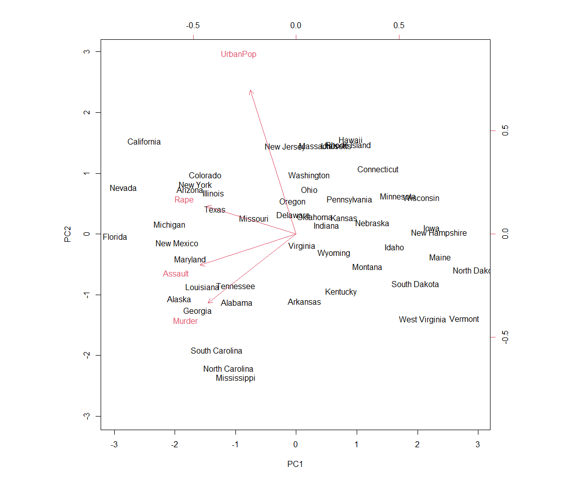
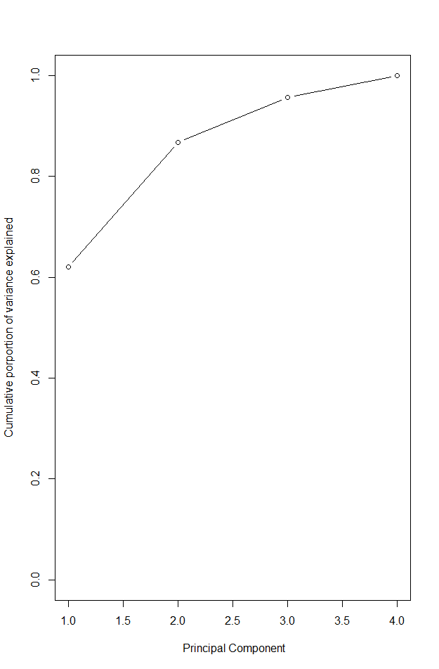
Figure 2. Cumulative proportion of variance explained
states <- row.names(USArrests)
states # shows rows
names(USArrests) #view columns

apply(USArrests, 2, mean) # apply mean to columns (=2)
apply(USArrests, 2, var) # examine column variances

# as mean and variance very different we should scale this before PCA
# PCA performed using function prcomp()

pr.out <- prcomp(USArrests, scale = TRUE) # be default scaled to mean = 0, scale = true scales variables to sd 1

names(pr.out)
# center and scale are means and sd of variables used for scaling
pr.out$center
pr.out$scale

pr.out$rotation # provides PC loadings

dim(pr.out$x)

#plot first 2 PC - Figure 1.
biplot(pr.out, scale = 0) # scale = 0 ensures that arrows scaled to represent loadings

#can make a mirror image
pr.out$rotation = -pr.out$rotation
pr.out$x = -pr.out$x
biplot(pr.out, scale = 0)

# get sd
pr.out$sdev
# variable by squaring sd
pr.var <- pr.out$sdev^2
pr.var

#computer proportion of variance explained by each PC - divide var by total var
pve <- pr.var / sum(pr.var)
pve

# can plot PVE by each component as well as cumulative PVE - Figure 2.
par(mfrow = c(1,2))
plot(pve, xlab = "principal component",
     ylab = "proportion of variance explained", ylim = c(0,1),
     type = "b")

plot(cumsum(pve), xlab = " Principal Component",
     ylab = "Cumulative porportion of variance explained",
     ylim = c(0,1), type = "b")

# Matrix completion

X <- data.matrix(scale(USArrests))
pcob <- prcomp(X)
summary(pcob)

sX <- svd(X)
names (sX) #d is sd vector, U is standardised scores, V is loading matrix
round(sX$v, 3)

#now omit random 20 entries

nomit <- 20
set.seed(15)
ina <- sample(seq(50), nomit)
inb <- sample(1:4, nomit, replace = TRUE)
Xna <- X
index.na <- cbind(ina, inb)
Xna[index.na] <- NA
K Means Clustering
Figure 3. K-means clustering results
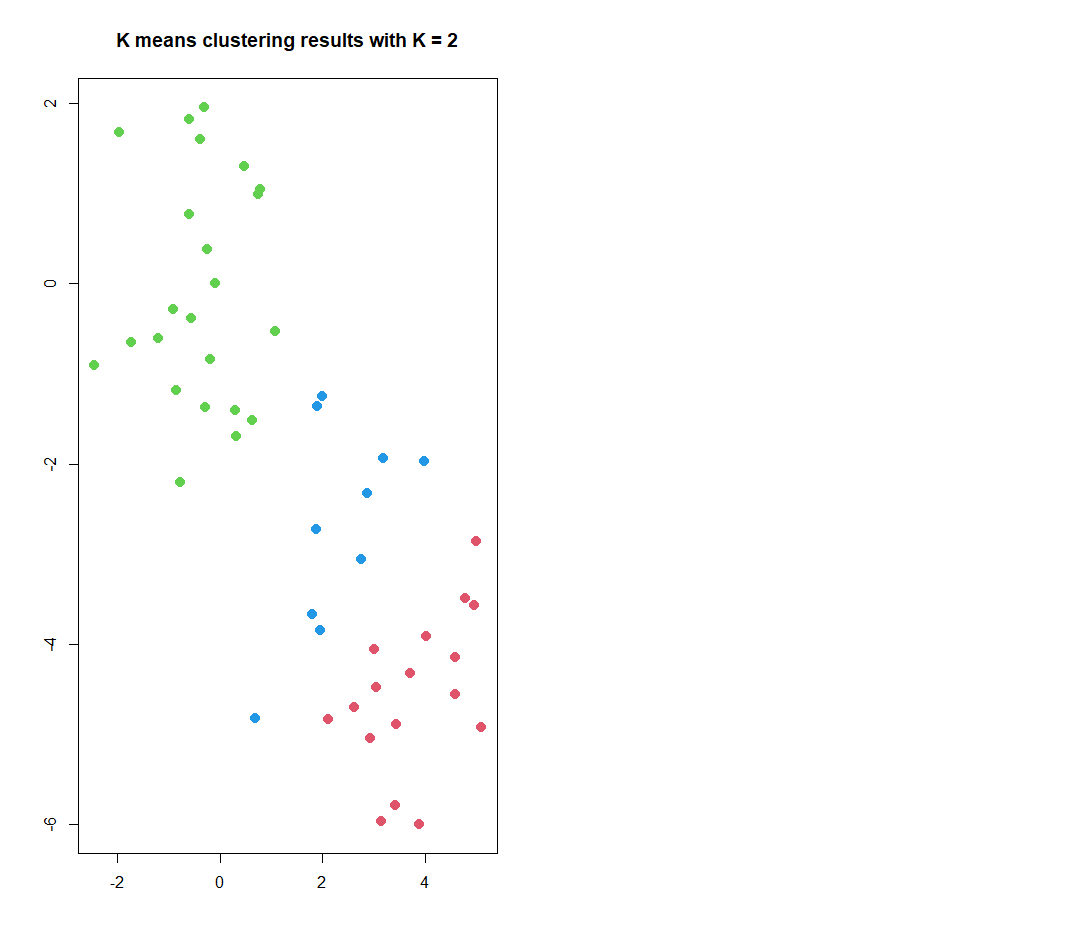
set.seed(2)
x <- matrix(rnorm(50 * 2), ncol = 2) #make 2 clusters with a mean shift
x[1:25, 1] <- x[1:25, 1] + 3
x[1:25, 2] <- x[1:25, 2] - 4

# k means clustering with K=2

km.out <- kmeans(x, 2, nstart = 20)

# cluster assignment of each of the 50 observation observed:
km.out$cluster

#plot data . Figure 3

par(mfrow = c(1,2))
plot(x, col = (km.out$cluster + 1),
     main = "K means clustering results with K = 2",
     xlab = "", ylab = "", pch = 20, cex = 2)

# often do not know number of clusters, could have used K =3
set.seed(4)
km.out <- kmeans(x, 3, nstart = 20)
km.out

# nstart used to run multiple initial cluster assignments, compare 1 to 20 and look at within cluster sum of squares

set.seed(4)
km.out <- kmeans(x, 3, nstart = 1)
km.out$tot.withinss # 104.33

set.seed(4)
km.out <- kmeans(x, 3, nstart = 20)
km.out$tot.withinss # 97.97

# want to minimise sum of squares - book recommends starting with nstart of 20 to 50
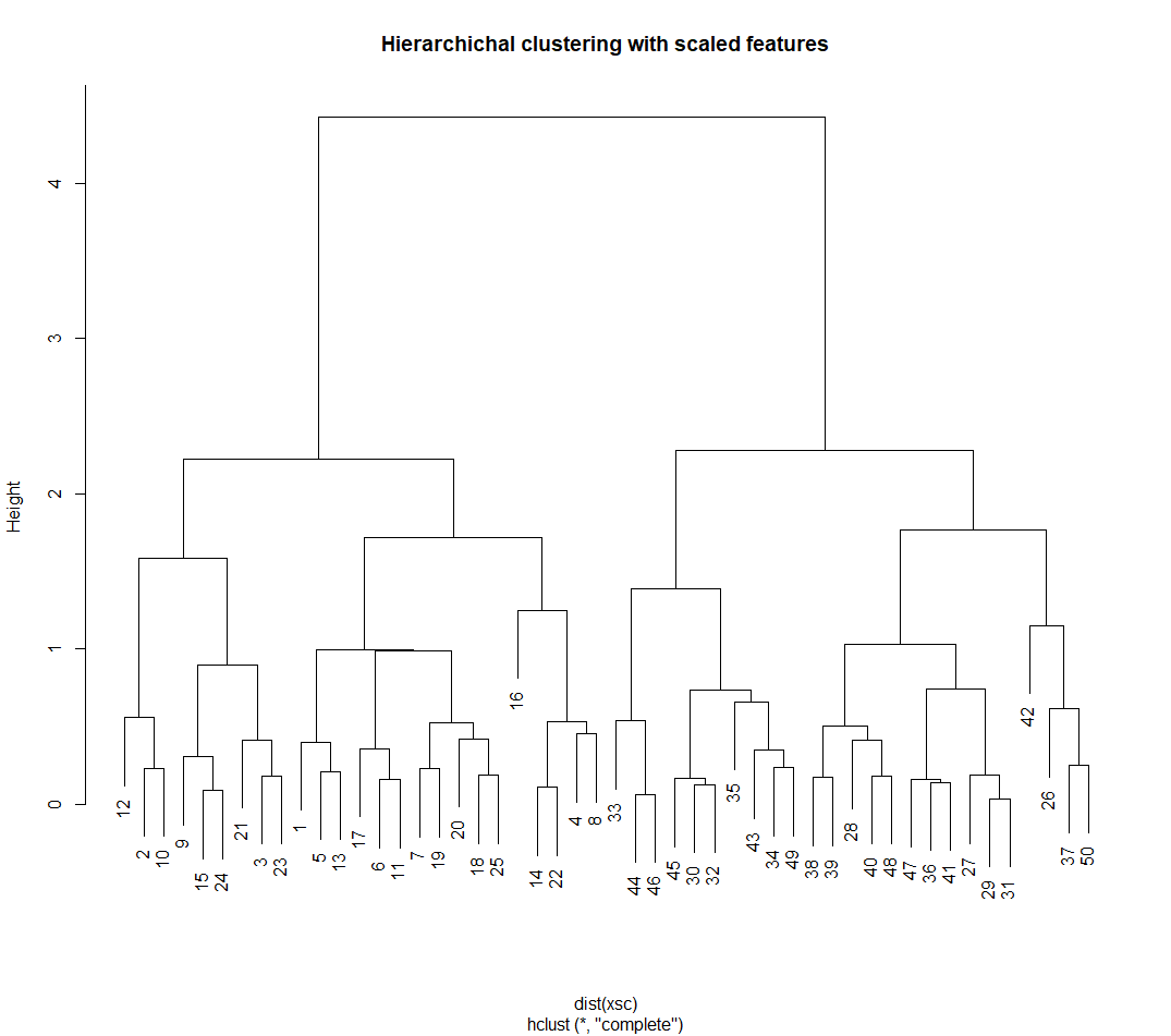
Hierarchical Clustering
Figure 4. Hierarchical clustering results
# hierarchical clustering - hclust()

hc.complete <- hclust(dist(x), method = "complete")

# could use average or single linking
hc.average <- hclust(dist(x), method = "average")
hc.single <- hclust(dist(x), method = "single")

#plot
par(mfrow = c(1, 3))
plot(hc.complete, main = "Complete linkage",
     xlab = "", sub = "", cex = .9)
plot(hc.average, main = "Average linkage",
     xlab = "", sub = "", cex = .9)
plot(hc.single, main = "Single linkage",
     xlab = "", sub = "", cex = .9)

# determine cluster labels - second arguement is number of cluster to obtain

cutree(hc.complete, 2)
cutree(hc.average, 2)
cutree(hc.single, 2)


cutree(hc.single, 4)

# to scale before clustering: Figure 4
xsc <- scale(x)
plot(hclust(dist(xsc), method = "complete"),
     main = "Hierarchichal clustering with scaled features")

# correlation based distanced calculated using as.dist() - would need at least 3 features in data

# make data (no known clusters)
x <- matrix(rnorm(30 *3), ncol = 3)
dd <- as.dist(1 - cor(t(x)))

plot(hclust(dd, method = "complete"),
     main = "Complete linkage with correlation based distance",
     xlab = "", sub = "")
PCA on tumour cell microarrays
# NC160 Data example, 12.5.4 - cancr cell line microarray data

library(ISLR2)
nci.labs <- NCI60$labs # labs are labels for cancer types
nci.data <- NCI60$data

dim(nci.data) #64 x 6830

nci.labs[1:4]
table(nci.labs)

#  PCA on NC160 data

pr.out <- prcomp(nci.data, scale = TRUE)

# plot first few PCA score vectors

# create function that assigns distinct colour to each element of numeric vector
# this will be used to give a colour to each of the 64 cell lines based on cancer

Cols <- function(vec){
  cols <- rainbow(length(unique(vec)))
  return(cols[as.numeric(as.factor(vec))])
}

# plot principal component score vectors

par(mfrow = c(1, 2))
plot(pr.out$x[, 1:2], col = Cols(nci.labs), pch = 19,
     xlab = "Z1", ylab = "Z2")
plot(pr.out$x[, c(1, 3)], col = Cols(nci.labs), pch = 19,
     xlab = "Z1", ylab = "Z3")


# summary of PVE

summary(pr.out)

plot(pr.out)

#scree plot and cumulative PVE

pve = 100 * pr.out$sdev^2 / sum(pr.out$sdev^2)
par(mfrow = c(1, 2))
plot(pve, type = "o", ylab = "PVE",
     xlab = "Principal component", col = "blue")

plot(cumsum(pve), type = "o", ylab = "Cumulative brown3PVE",
     xlab = "Principal component", col = "brown3")

# cluster the observations from NC160 data

#standardise variables (if want each gene to be on same scale)

sd.data <- scale(nci.data)
 #perform hierarchical clustering - using different types of linkage

par(mfrow = c (1, 3))
data.dist <- dist(sd.data)
plot(hclust(data.dist), xlab = "", sub = "", y = "",
     labels = nci.labs, main = "complete linkage")
plot(hclust(data.dist, method = "average"),
     labels = nci.labs, main = "Average  linkage", xlab = "", sub = "", y = "",)
plot(hclust(data.dist, method = "single"),
     labels = nci.labs, main = "Single  linkage", xlab = "", sub = "", y = "",)


# cut dendogram at height to yeold 4 clusters

hc.out <- hclust(dist(sd.data))
hc.clusters <- cutree(hc.out, 4)
table(hc.clusters, nci.labs)

# plot cut on dendrogram

par(mfrow = c(1, 1))
plot(hc.out, labels = nci.labs)
abline(h = 139, col = "red") # abline() draws a straight line on any plot (here at heigh 139)

# get summary of the object
hc.out

# how do the clusters compare to if used k-means with k =4

set.seed(2)
km.out <- kmeans(sd.data, 4, nstart = 20)
km.clusters <- km.out$cluster
table(km.clusters, hc.clusters) # cluster 4 in kmeans is identical to cluster 3 in hierarchichial.

# could perform hierarchial clustering based on first few PC score vectors, somethimes this gives better results

hc.out <- hclust(dist(pr.out$x[, 1:5]))
plot(hc.out, labels = nci.labs,
  main = "Hier Clust on first five score vectors")
table(cutree(hc.out, 4), nci.labs)