Plotly Developments - Python
Task
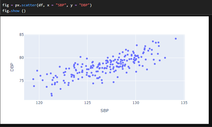
Work through the notebook to examine various methods in plotly to visualise blood pressure data. The notebook worked through obtaining an overview, as well as renaming, organising and grouping the data. Generation of choropleth, bar and pie charts was undertaken. A final task was to generate a plot of your choosing using the blood pressure data (figure 1)
Figure 1. Scatter graph examining correlation between systemic and dyastolic blood pressure measurements