import pandas as pd
import numpy as np
import matplotlib as mpl
import matplotlib.pyplot as plt
%matplotlib inline
import seaborn as sns
import scipy.stats as st
from sklearn import ensemble, tree, linear_model
import missingno as msno
auto = pd.read_csv(r"C:\xxxxx\Sonya\Machine learning\Unit02 auto-mpg (1).csv")auto.describe()| mpg | cylinders | displacement | weight | acceleration | model year | origin | |
|---|---|---|---|---|---|---|---|
| count | 398.000000 | 398.000000 | 398.000000 | 398.000000 | 398.000000 | 398.000000 | 398.000000 |
| mean | 23.514573 | 5.454774 | 193.425879 | 2970.424623 | 15.568090 | 76.010050 | 1.572864 |
| std | 7.815984 | 1.701004 | 104.269838 | 846.841774 | 2.757689 | 3.697627 | 0.802055 |
| min | 9.000000 | 3.000000 | 68.000000 | 1613.000000 | 8.000000 | 70.000000 | 1.000000 |
| 25% | 17.500000 | 4.000000 | 104.250000 | 2223.750000 | 13.825000 | 73.000000 | 1.000000 |
| 50% | 23.000000 | 4.000000 | 148.500000 | 2803.500000 | 15.500000 | 76.000000 | 1.000000 |
| 75% | 29.000000 | 8.000000 | 262.000000 | 3608.000000 | 17.175000 | 79.000000 | 2.000000 |
| max | 46.600000 | 8.000000 | 455.000000 | 5140.000000 | 24.800000 | 82.000000 | 3.000000 |
#identify missing valuesauto.info()<class 'pandas.DataFrame'>
RangeIndex: 398 entries, 0 to 397
Data columns (total 9 columns):
# Column Non-Null Count Dtype
--- ------ -------------- -----
0 mpg 398 non-null float64
1 cylinders 398 non-null int64
2 displacement 398 non-null float64
3 horsepower 398 non-null str
4 weight 398 non-null int64
5 acceleration 398 non-null float64
6 model year 398 non-null int64
7 origin 398 non-null int64
8 car name 398 non-null str
dtypes: float64(3), int64(4), str(2)
memory usage: 28.1 KB# there are no missing values; visualise with msno
msno.matrix(auto)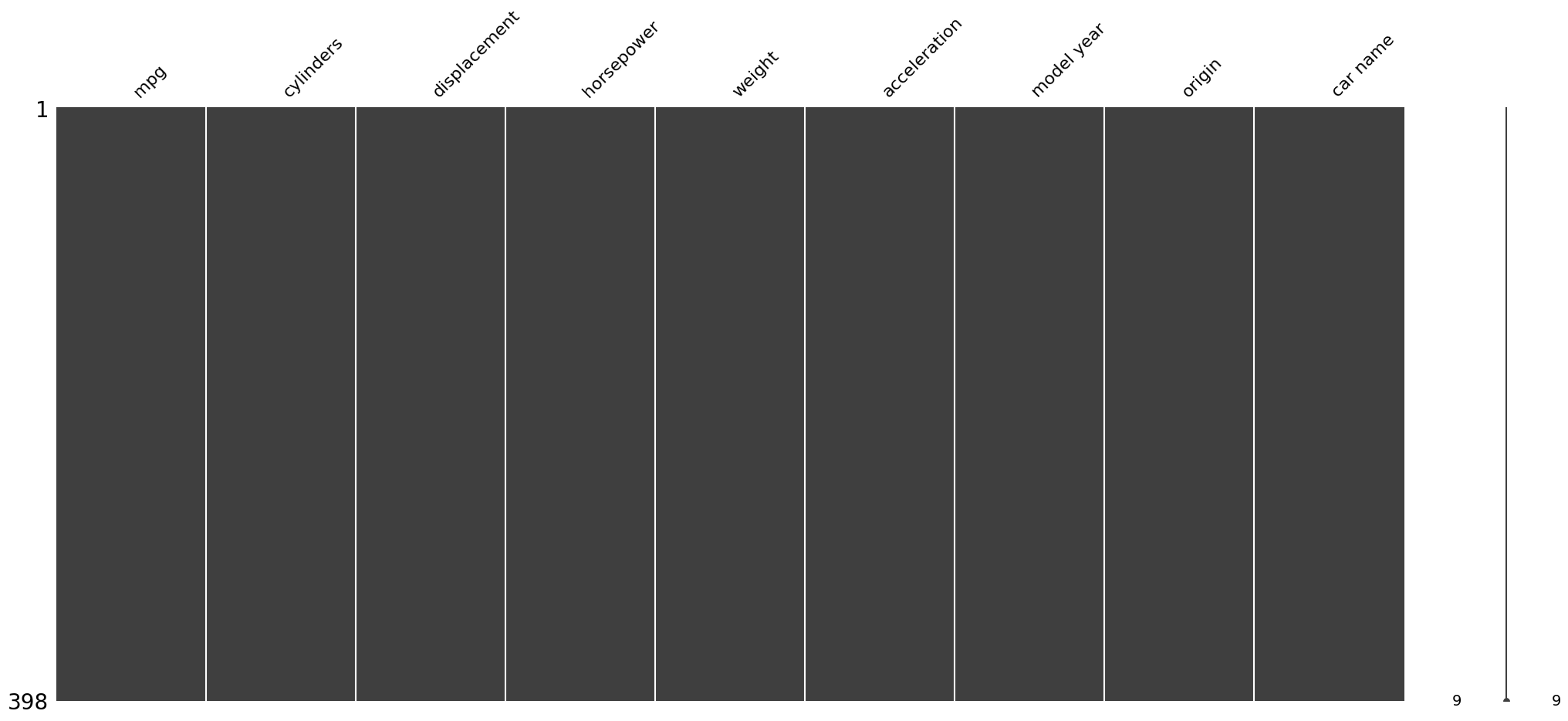
msno.bar(auto, color = 'g', figsize = (10,8))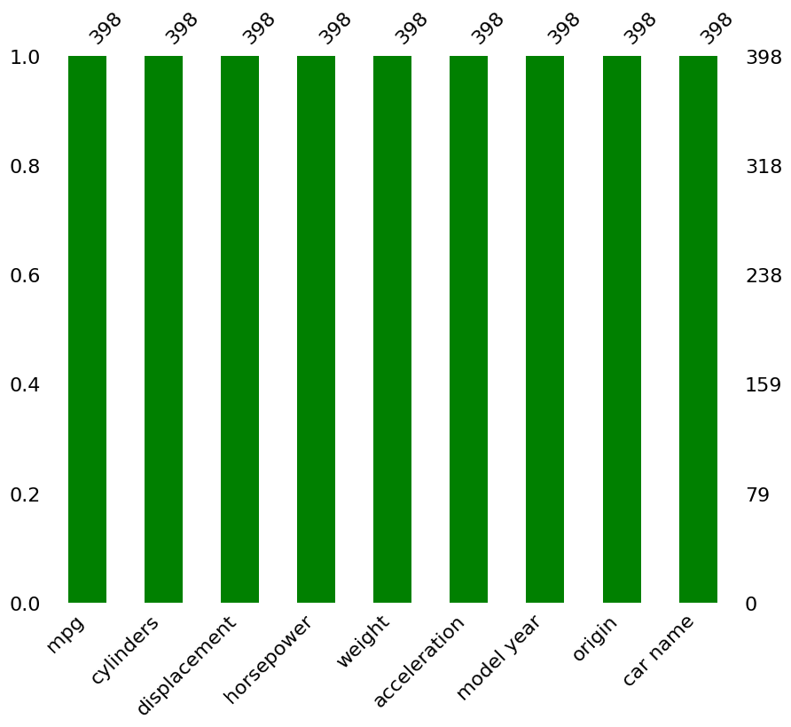
# invesitgate skewness and kurtosis
auto.select_dtypes(include=["number"]).skew()
mpg 0.457066
cylinders 0.526922
displacement 0.719645
weight 0.531063
acceleration 0.278777
model year 0.011535
origin 0.923776
dtype: float64#why is horespower a string? - look at dataauto.head()| mpg | cylinders | displacement | horsepower | weight | acceleration | model year | origin | car name | |
|---|---|---|---|---|---|---|---|---|---|
| 0 | 18.0 | 8 | 307.0 | 130 | 3504 | 12.0 | 70 | 1 | chevrolet chevelle malibu |
| 1 | 15.0 | 8 | 350.0 | 165 | 3693 | 11.5 | 70 | 1 | buick skylark 320 |
| 2 | 18.0 | 8 | 318.0 | 150 | 3436 | 11.0 | 70 | 1 | plymouth satellite |
| 3 | 16.0 | 8 | 304.0 | 150 | 3433 | 12.0 | 70 | 1 | amc rebel sst |
| 4 | 17.0 | 8 | 302.0 | 140 | 3449 | 10.5 | 70 | 1 | ford torino |
#convert horsepower to numberical
auto['horsepower'] = pd.to_numeric(auto['horsepower'], errors='coerce')auto.select_dtypes(include=["number"]).skew()mpg 0.457066
cylinders 0.526922
displacement 0.719645
horsepower 1.087326
weight 0.531063
acceleration 0.278777
model year 0.011535
origin 0.923776
dtype: float64# model year is roughly symmetrical, others are skewed to the right, i.e. some values are larger#Model year is approximately symmetric. The remaining variables are positively skewed to varying degrees, meaning most observations occur at lower values while a smaller number of large values create a right tail.
#Horsepower is the most strongly right-skewed variable.auto.select_dtypes(include=["number"]).kurt()mpg -0.510781
cylinders -1.376662
displacement -0.746597
horsepower 0.696947
weight -0.785529
acceleration 0.419497
model year -1.181232
origin -0.817597
dtype: float64#Most variables have negative kurtosis, indicating flatter distributions with lighter tails than a normal distribution.
#Horsepower and acceleration have positive kurtosis, suggesting somewhat heavier tails and a greater presence of extreme values, particularly for horsepower.#correlation heat map
#first select the numeric values
numeric_features = auto.select_dtypes(include=[np.number])
correlation = correlation = numeric_features.corr()f , ax = plt.subplots(figsize = (14,12))
plt.title('Correlation of Numeric Features',y=1,size=16)
sns.heatmap(correlation,square = True, vmax=0.8)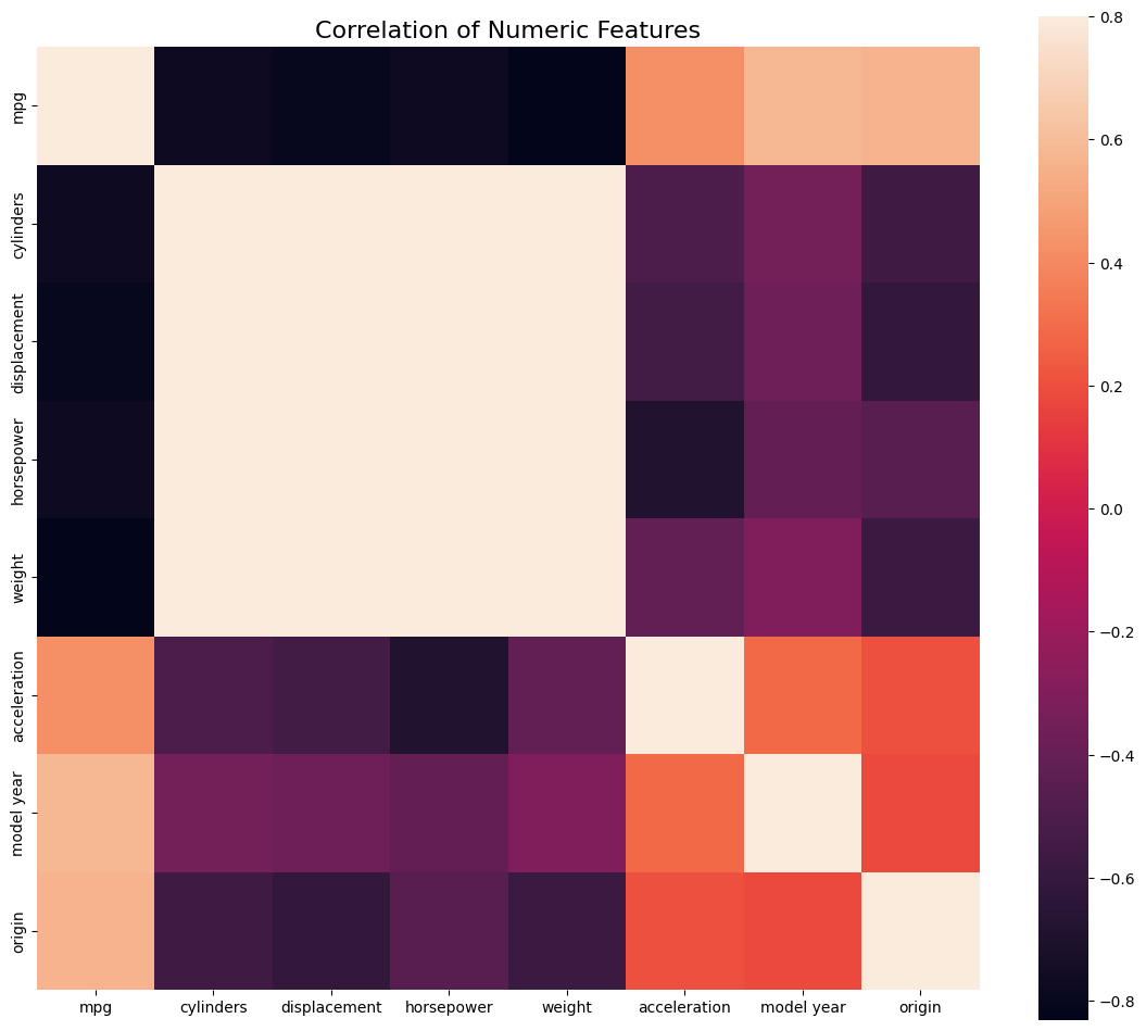
#cylinders, displacement, horsepower and weight are stringly correlated#catterplot for different parameters
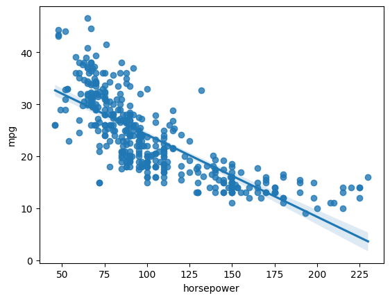
sns.regplot(x='horsepower',y = 'mpg',data = auto,scatter= True, fit_reg=True)
# scatterplot grid

fig, axes = plt.subplots(nrows=2, ncols=2, figsize=(14,10))

sns.regplot(x='horsepower',y = 'mpg',data = auto,scatter= True, fit_reg=True, ax=axes[0,0] )
sns.regplot(x='horsepower',y = 'weight',data = auto,scatter= True, fit_reg=True, ax=axes[0,1])
sns.regplot(x='horsepower',y = 'acceleration',data = auto,scatter= True, ax=axes[1,0])
sns.regplot(x='acceleration',y = 'weight',data = auto,scatter= True, ax=axes[1,1])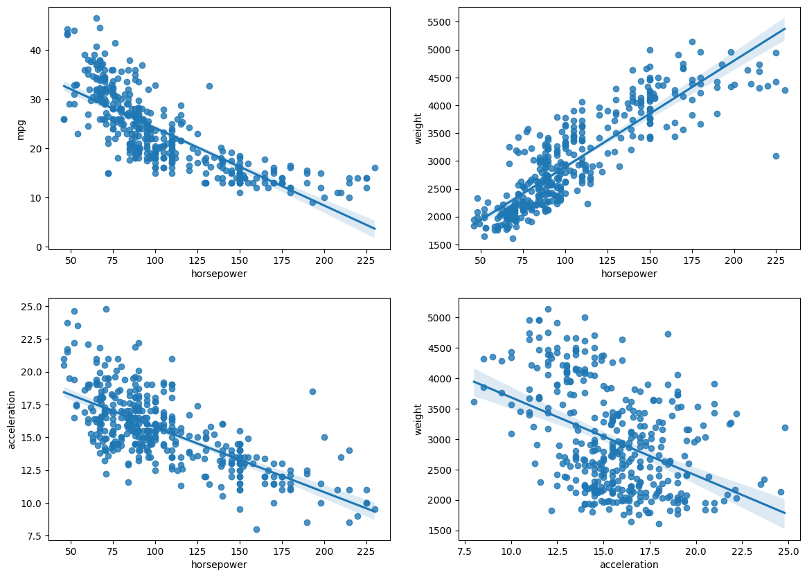
#replace categorical value with numberical; i.e. country names with codes
#already numerical, but example coding
categorical_features = ['origin']
for c in categorical_features:
auto[c] = auto[c].astype('category')
if auto[c].isnull().any():
auto[c] = auto[c].cat.add_categories(['MISSING'])
auto[c] = auto[c].fillna('MISSING')
# convert categories to numbers
auto[c] = auto[c].cat.codes# or autmatically select columsn which are type = object categorical_features = auto.select_dtypes(include='object').columns
for c in categorical_features:
auto[c] = auto[c].astype('category')
if auto[c].isnull().any():
auto[c] = auto[c].cat.add_categories(['MISSING'])
auto[c] = auto[c].fillna('MISSING')
auto[c] = auto[c].cat.codes